Digital Mapping Tool
Population at risk, where are they?
Black/African American and Hispanic/Latino populations in the United States are disproportionately affected by the HIV infection. Lack of job stability, education and consequently income are some of the factors that increase the risk for infection in our country.
While overall HIV infection rates in the United States have stabilized in recent years, they have remained highest among men who have sex with men (MSM), who account for 76% of new HIV infections in men.
CDC researchers, reviewing data from 2009 to 2013, projected that 1 in 6 MSM would be diagnosed with HIV in their lifetime, including 1 in 2 black MSM, 1 in 4 Latino MSM, and 1 in 11 white MSM.
Injection drug use has long been associated directly or indirectly with approximately one-third of AIDS cases in the United States. Young people are also at risk for HIV infection. Many people get infected with HIV as a teen or young adult. About 1 in 4 (26%) of all new HIV infections is among youth ages 13 to 24 years
Considering the available data for HIV prevalence and HIV new infections in relationship with gender, income, people behavior, and geographical location, mapping could help us greatly to design prevention outreach interventions that really target the most needed.
We need to make sure we have included all the data necessary in the design of the community assessment process, to later input this information into our community map and strategically and geographically identify “hot spots” or priority areas to be intervened.
Let’s see examples of how data uploaded into maps can give us important information on how or where to conduct prevention interventions.
Maps provided by AIDSVU.ORG
AIDSVU is an interactive online mapping tool that visualizes the impact of the HIV epidemic on communities across the United States.
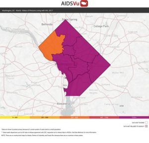
 Washington DC HIV Prevalence by ward
Map 1: Rate of people living with HIV in Washington DC by ward 2017. This color-coded map shows the level of prevalence when you move the pointer over the map.
Visit map online: https://bit.ly/2HkpfJm
*In this map you could easily tell if your organization, your target community or outreach efforts are concentrated in the wards with higher prevalence of HIV infection.
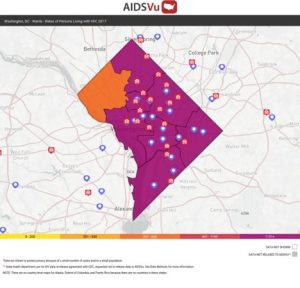
 HIV Prevalence in Washington DC and testing sites
Map 2: Rate of people living with HIV in Washington DC by ward 2017 and a layer of HIV testing sites plus Ryan White HIV/AIDS Medical Care Providers. The map shows information of testing sites as we move the pointer by the blue location icons map.
Visit map online at: https://bit.ly/3bsb3Mt
*In this map you could tell how many organizations and service providers are in ward, with the highest prevalence of HIV infection (Available also by zip code) useful as base for devising an intervention activity on the areas not covered by other programs.
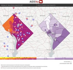
 HIV prevalence and Poverty in Washington DC
Map 3: Comparing HIV prevalence testing sites and AIDS organizations in Washington DC with a map describing percentage of the community by zip code living in poverty at the end of 2017.
*This comparison is not available by ward
Visit this map at: https://bit.ly/2UtWB0v
*In this map we could establish a possible relationship between income levels, job opportunities and the prevalence of HIV by zip code in Washington DC.
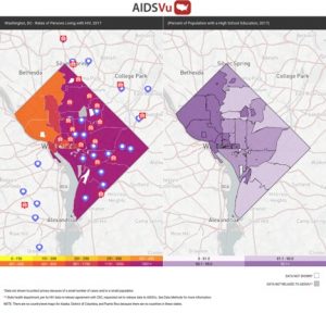
 HIV prevalence and education level in Washington DC
Map 4: Comparing HIV prevalence testing sites and AIDS organizations in Washington DC with a map describing percentage of the community by zip code that finished high school.
Visit this map at: https://bit.ly/3b9S7lB